Color Palette
A Color Palette is a curated selection of colors used in a design to convey brand identity, evoke emotions, and ensure visual harmony. A well-chosen color palette enhances the user experience by creating a visually appealing interface and ensuring accessibility for users with different abilities, such as those with color blindness.
Your color palette is one of the fastest ways users form a first impression of your product's quality and trustworthiness. A well-considered palette signals intentionality; a random one signals chaos. For B2B SaaS, color also affects perceived credibility — blues and neutrals signal professionalism, while neon palettes can feel immature to enterprise buyers regardless of product quality.
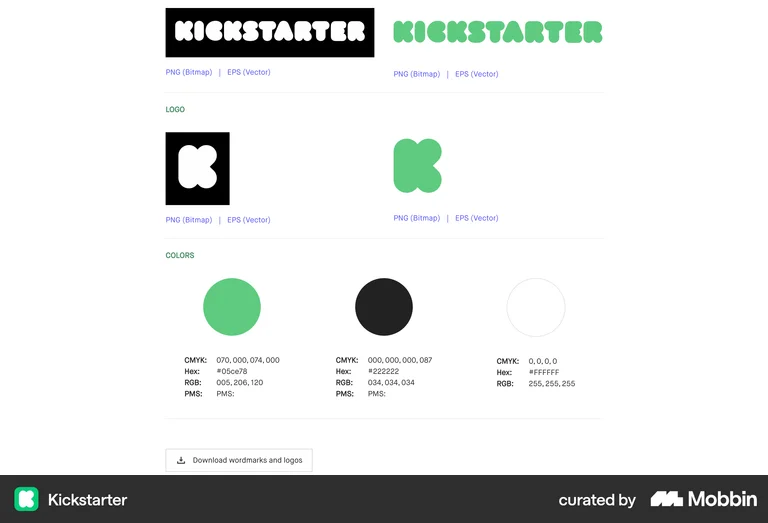
Kickstarter's brand page shows their full color palette with hex values, RGB, CMYK, and PMS codes alongside logo variants — a public brand guide that ensures anyone using their assets applies colors correctly and consistently.